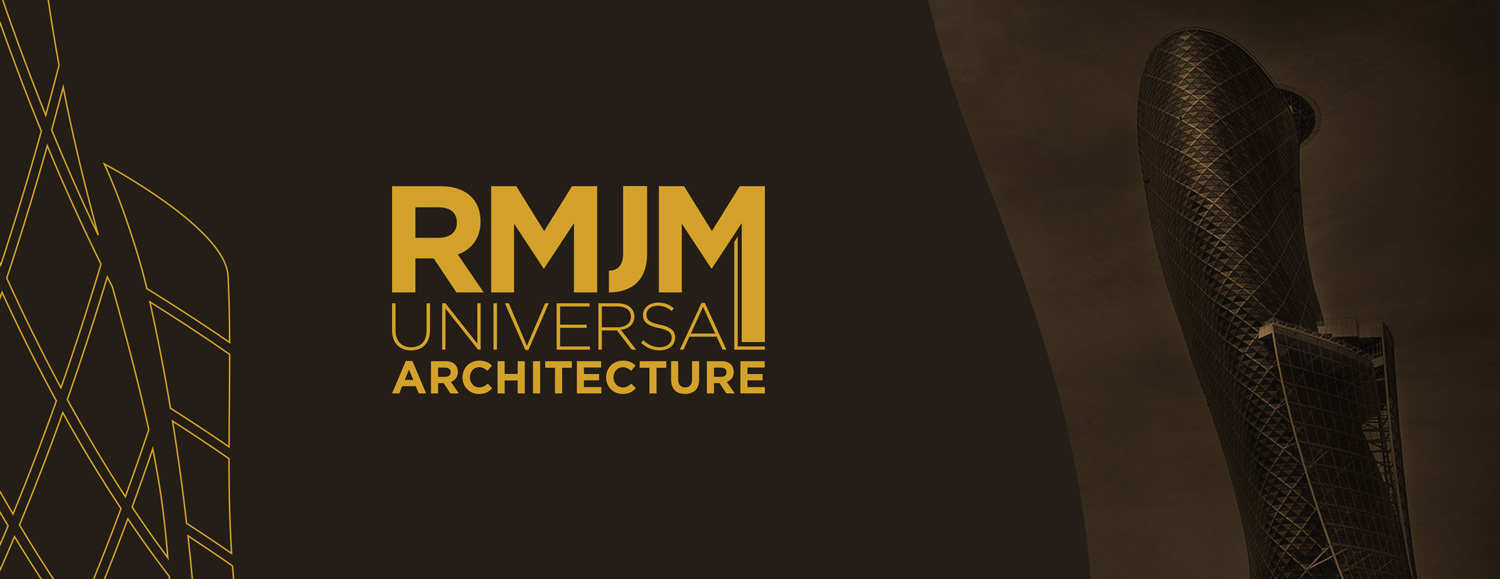
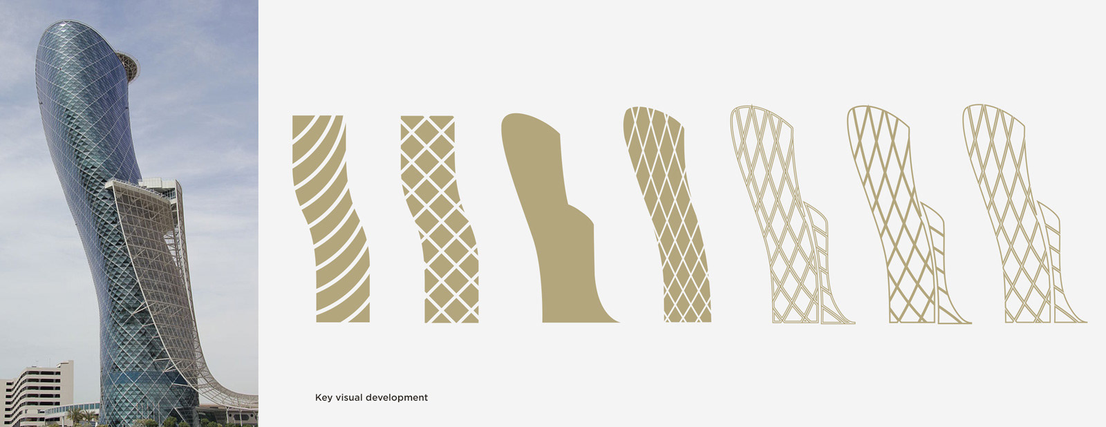
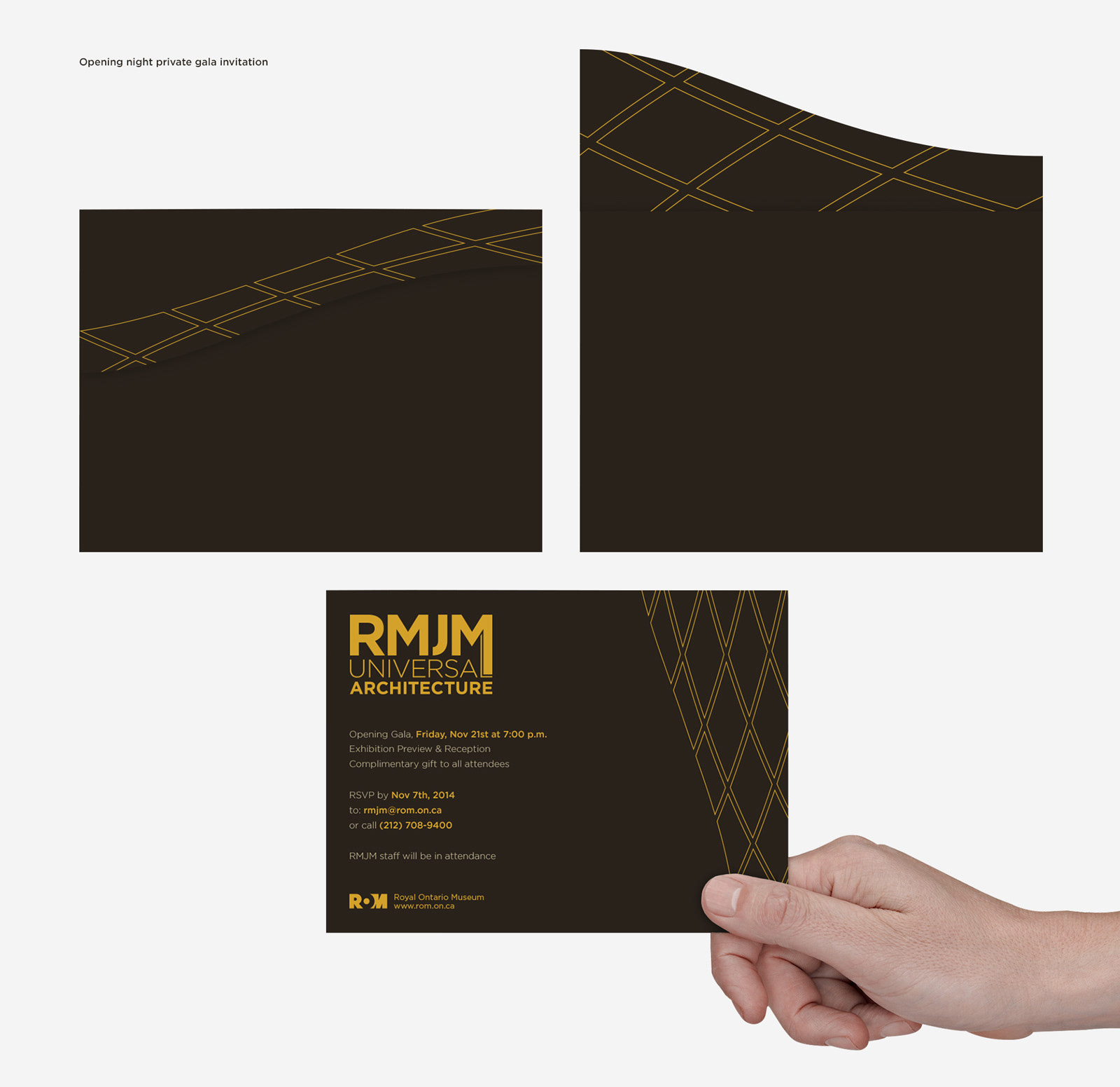
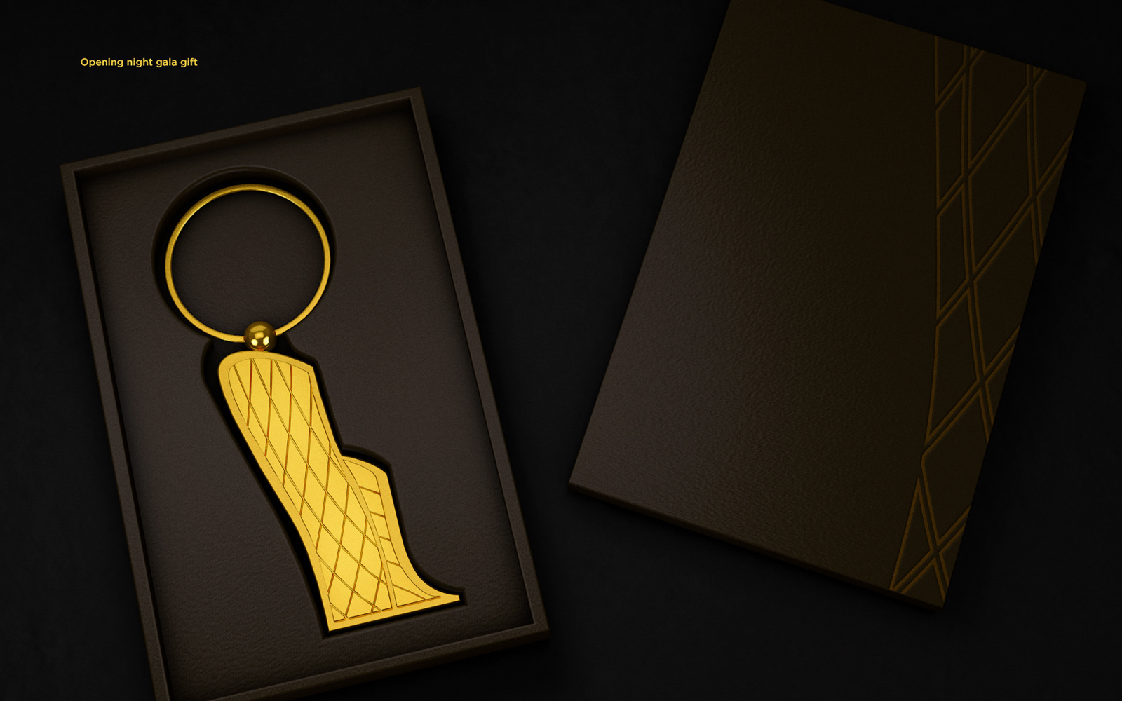
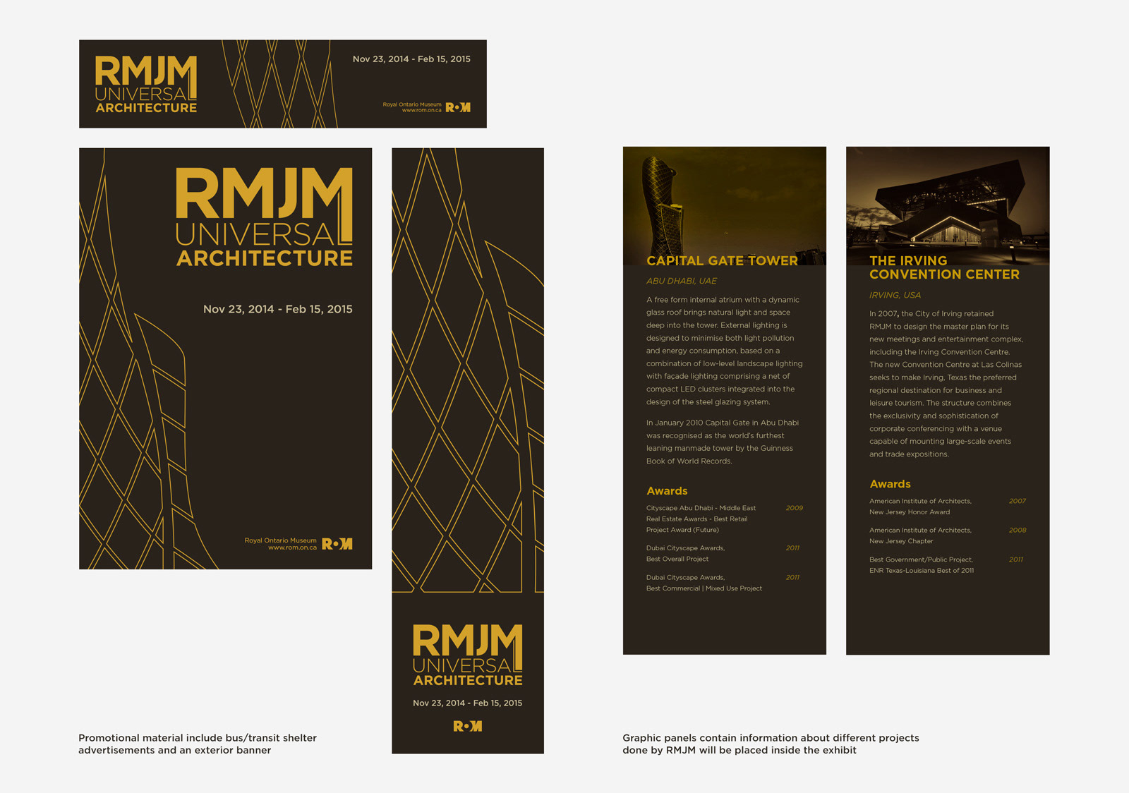
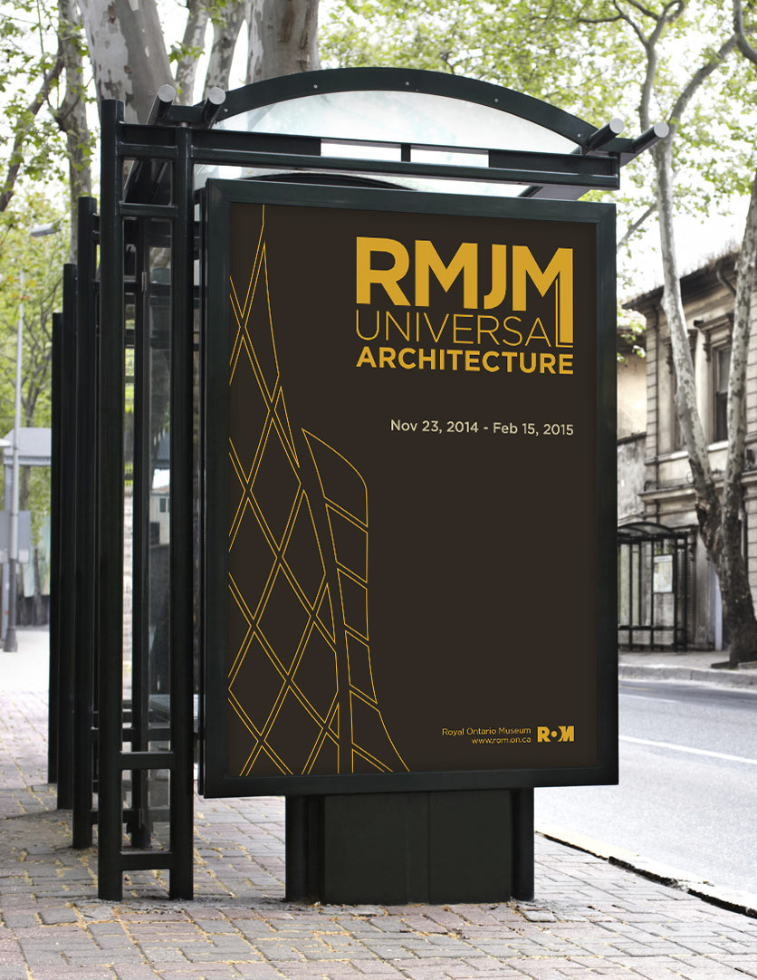
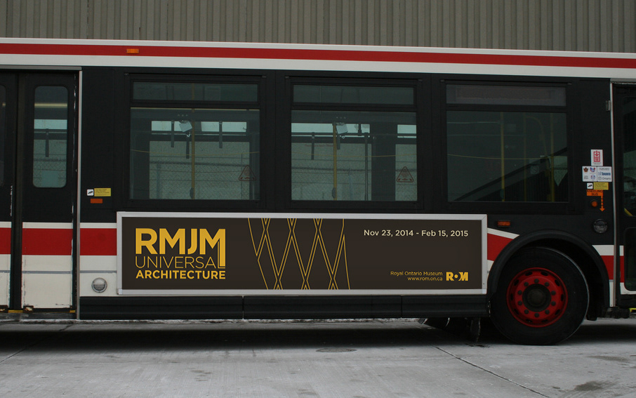
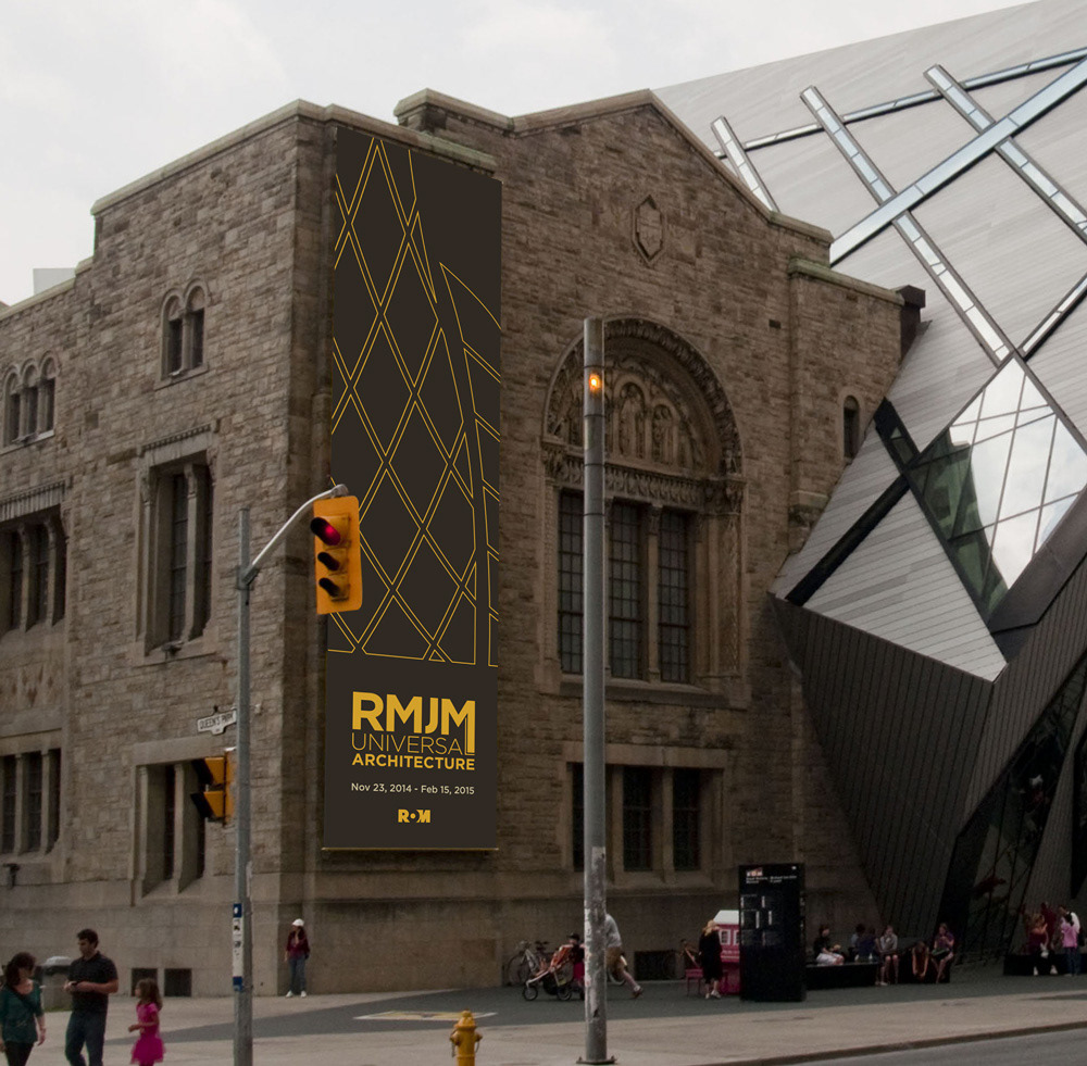
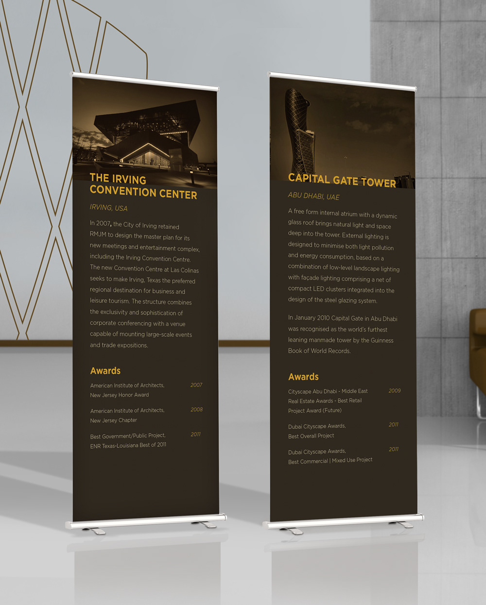

This project was for the experiential design course. The task was to work on a campaign to promote an architectural exhibit. I chose an international firm called RMJM and used one of their iconic buildings, The Capital Gate, as a visual keyart to design all the promotional and marketing materials. The colour scheme is inspired by the location of the building (Abu Dhabi, UAE) and its people's lifestyle/culture. The dark background colour represents oil, the yellow represents gold, and the light brown represents the soil and deserts. The wordmark incorporates a subtle yet meaningful typographic detail: the ‘L’ in universal is seamlessly connected to the ‘M’ above it. This intentional merging of forms represents the concept of universality, different elements coming together as one cohesive whole. It symbolizes unity and interconnectedness, visually reinforcing the event’s theme.